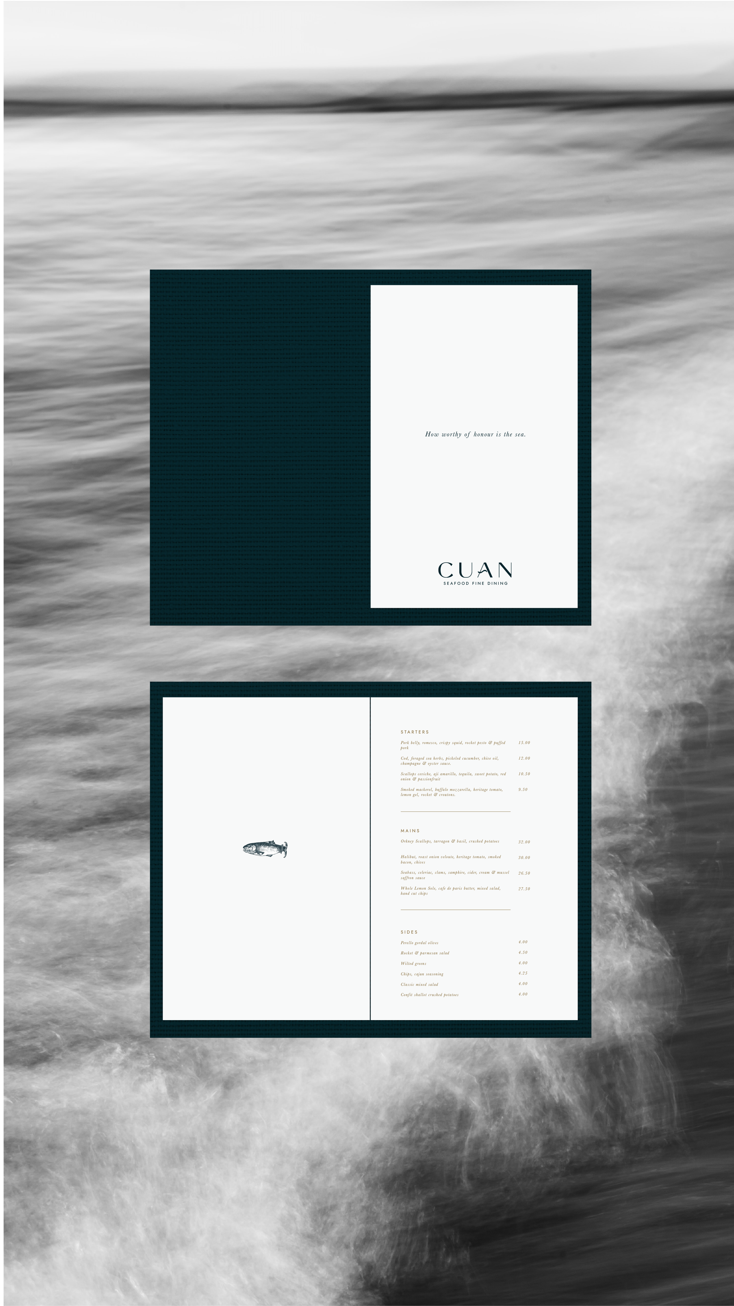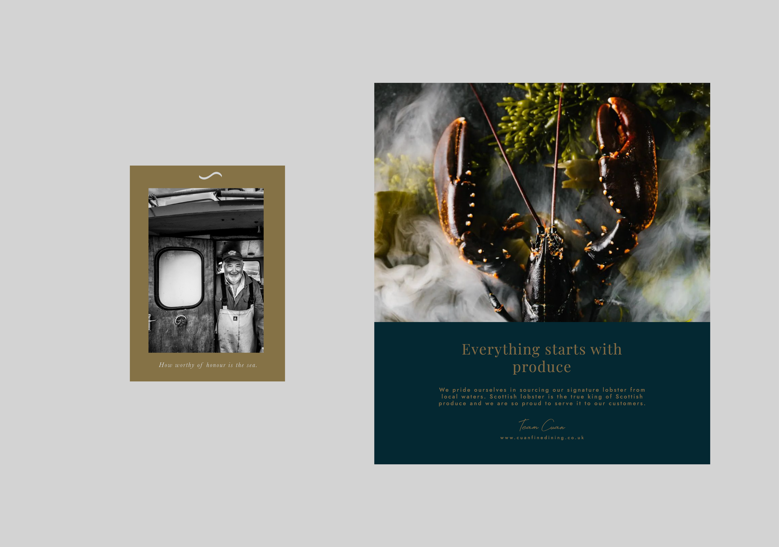
Cuan is a fine dining seafood restaurant that champions British produce and sustainability. With a menu built around the freshest locally sourced ingredients and a deep respect for sustainable fishing practices, the brand needed an identity that felt as refined and intentional as its ethos.
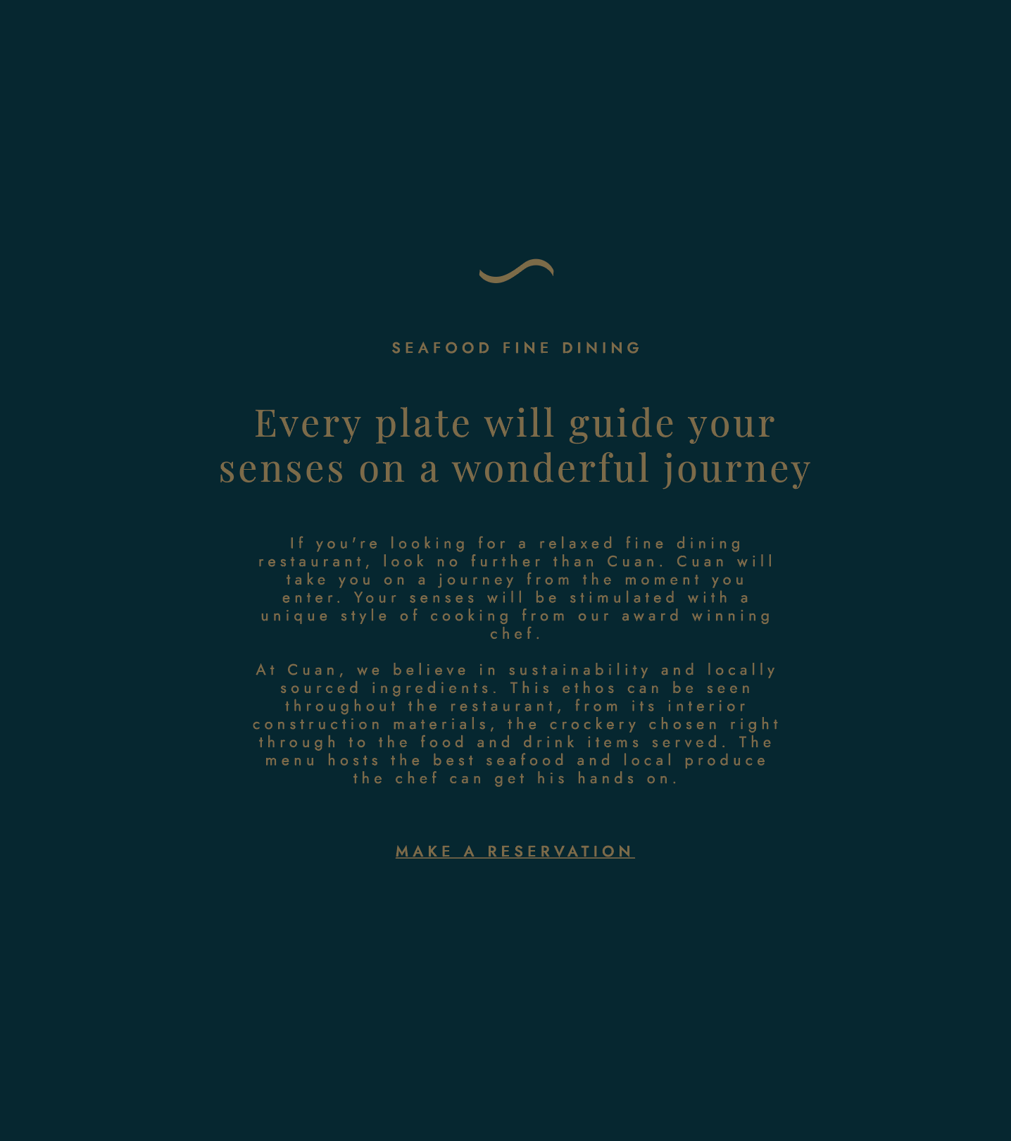
The brief was to create a brand identity that felt modern yet timeless — something that mirrored the restaurant’s elevated dining experience while taking visual cues from the natural world. From the soft flow of typography to the rich palette inspired by ocean greens, golden sands and Scottish mist, every element was designed to evoke calm, confidence and connection.
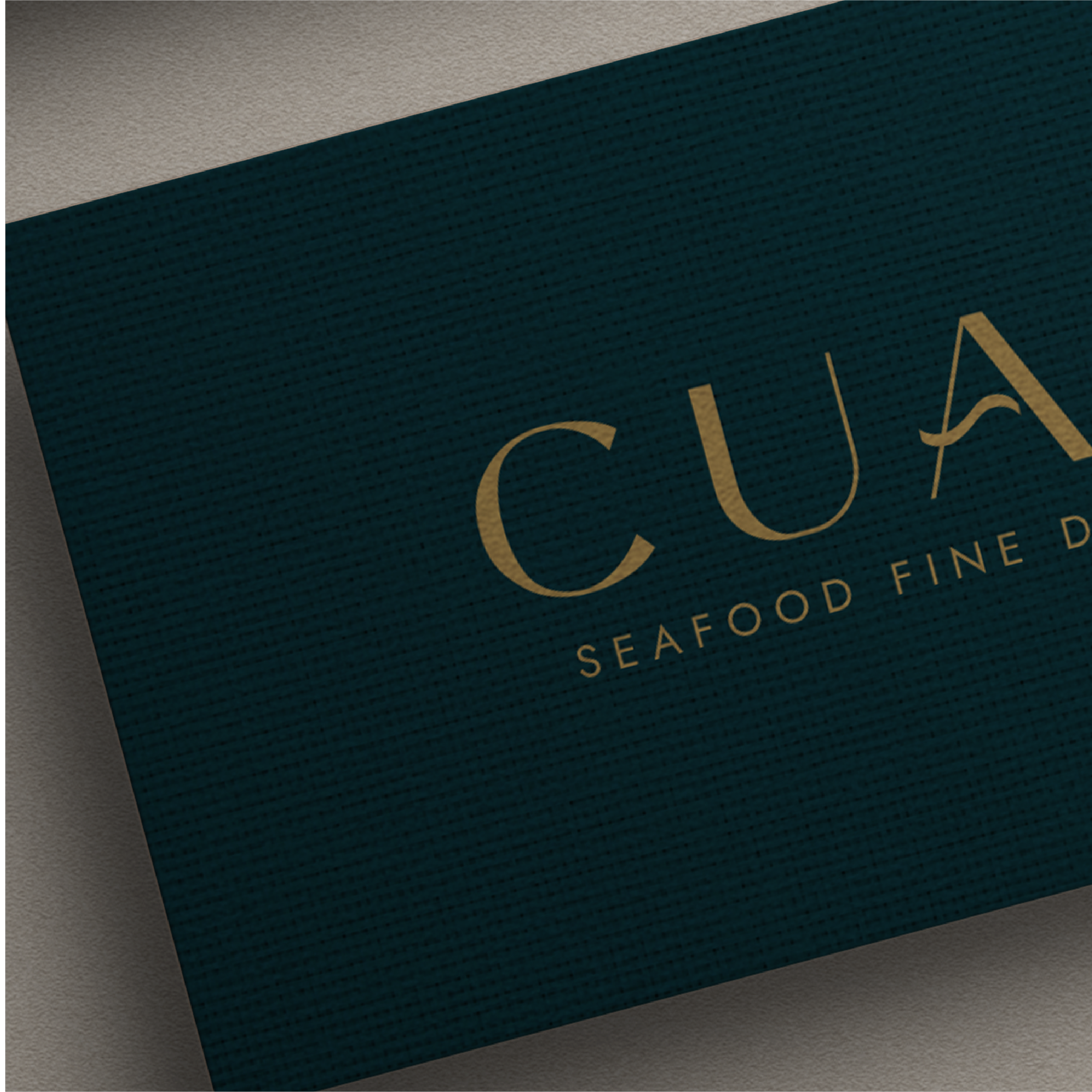
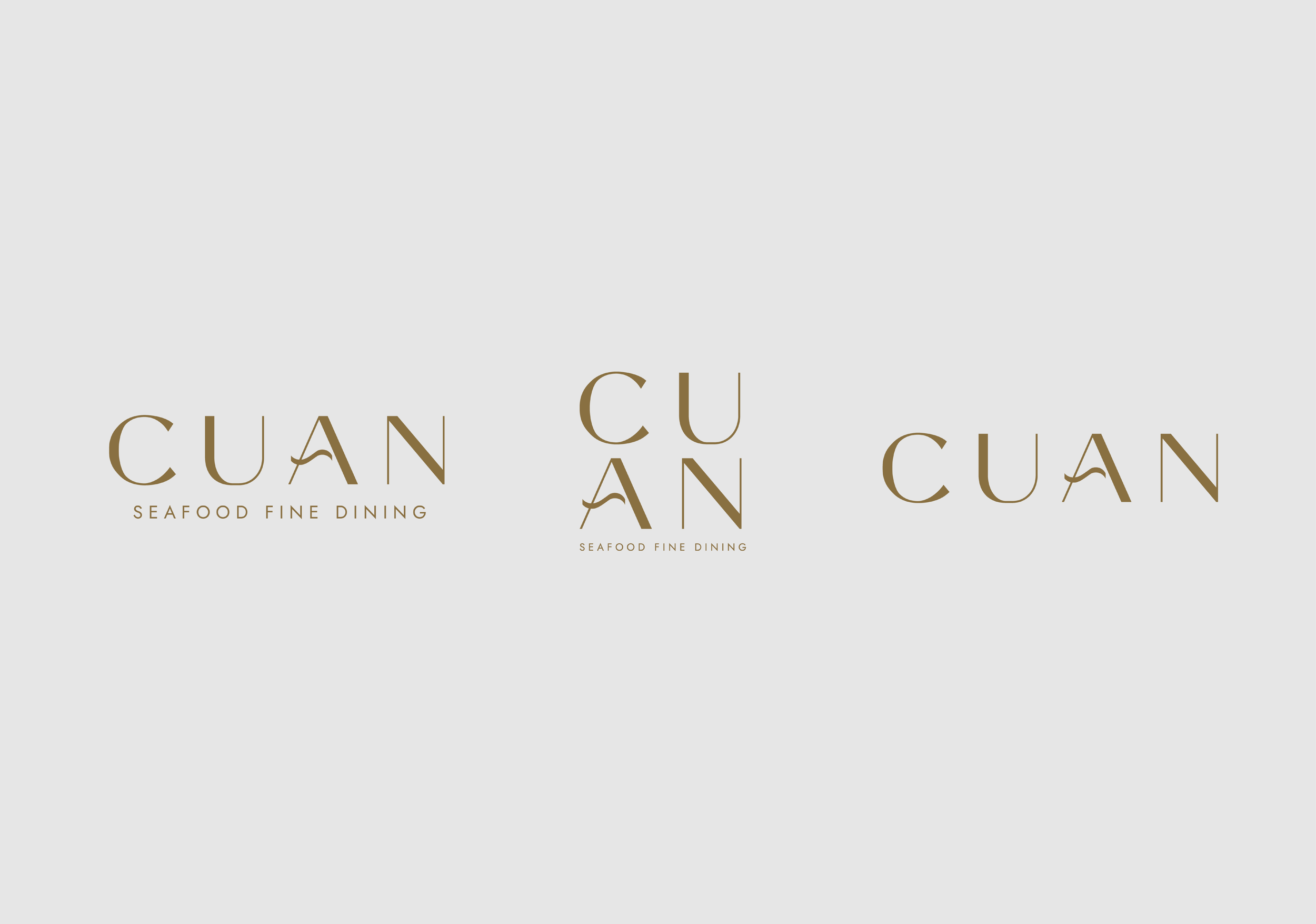
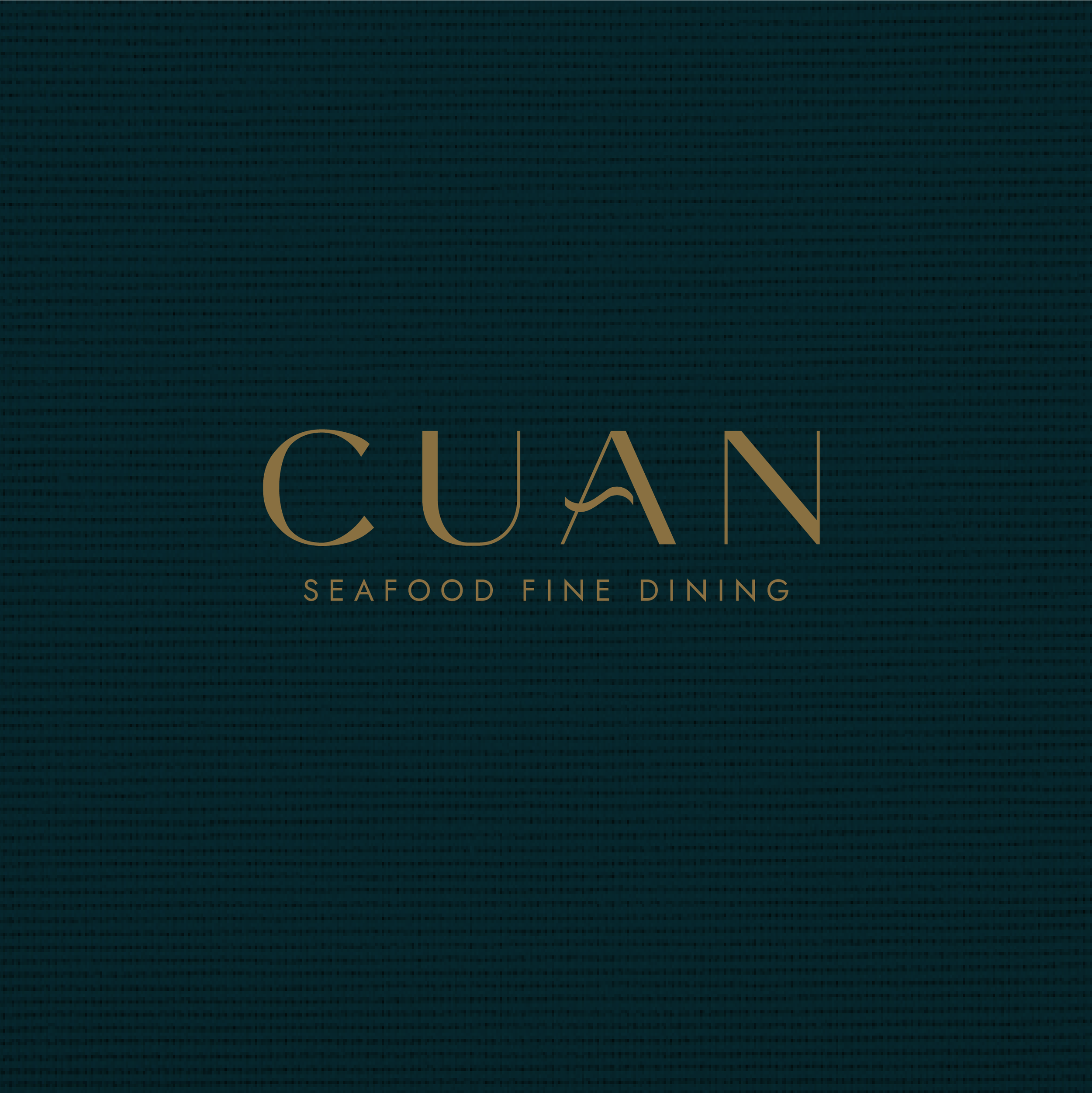
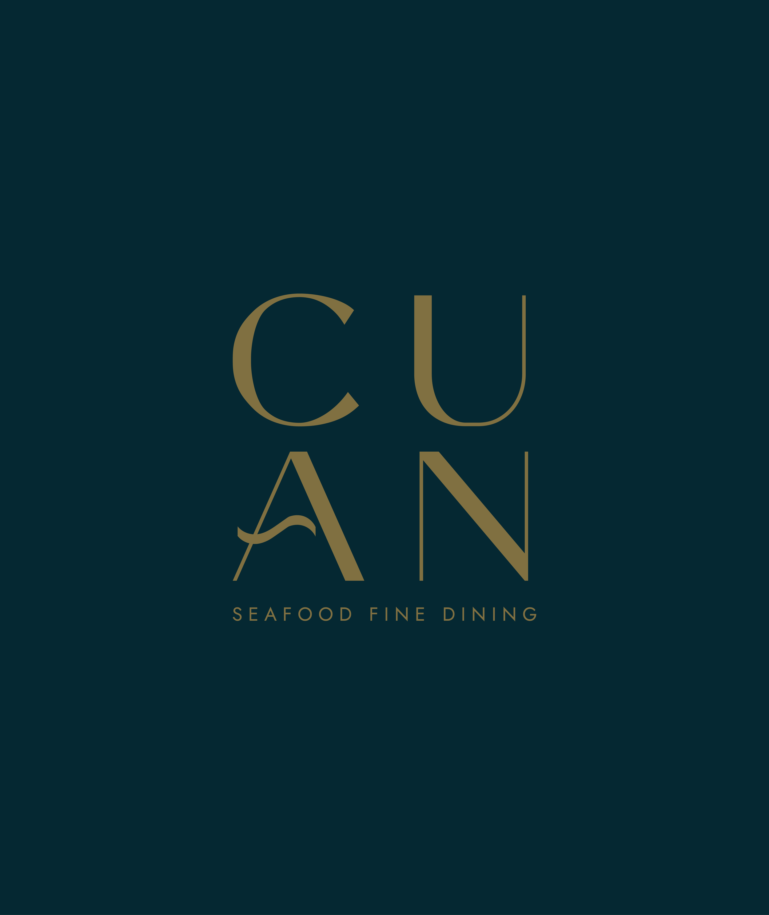
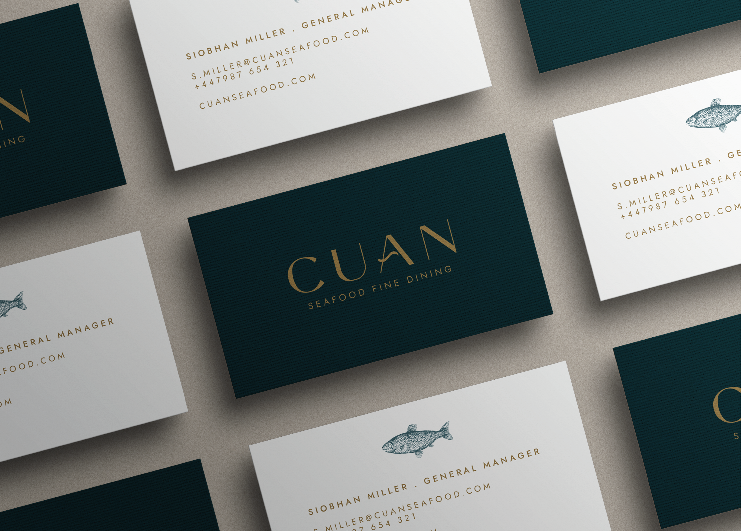
One of the standout features was the custom typography, which included a wave detail on the letter "A”, a nod to the sea that forms the heart of the restaurant’s story. This flowing motion was echoed throughout the brand to create a sense of harmony and elegance.
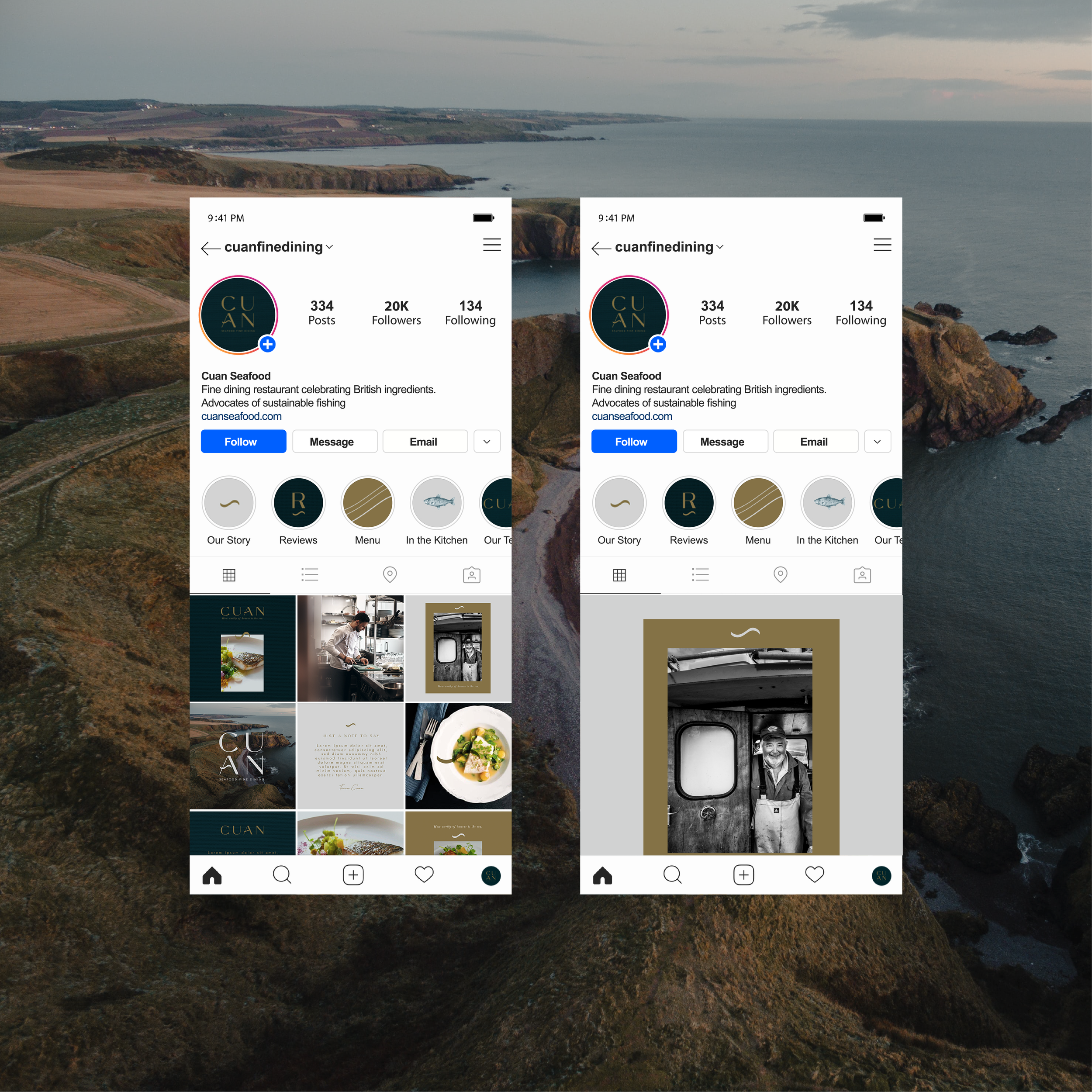
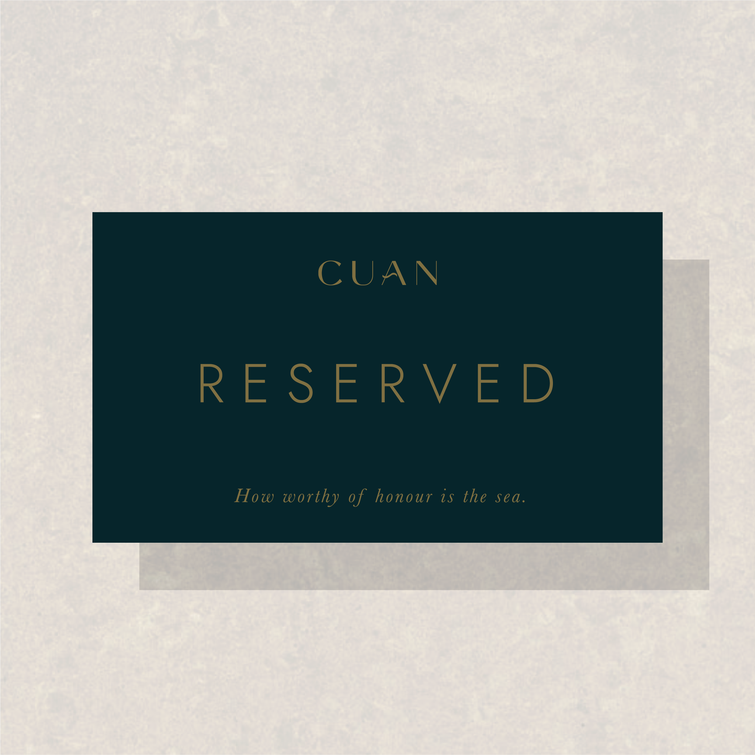
We carried this identity across digital and physical touchpoints, from menus and signage to a fully responsive website and social media presence. Our goal was to ensure Cuan’s brand not only reflected their values but also inspired trust, connection, and long-term loyalty.
The result is a brand that feels as considered as the ingredients on the plate, beautifully balanced, purpose-driven, and unmistakably Cuan.
Cuan